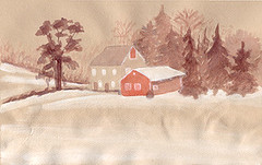
Watercolor on tan paper, 8 x 5 inches
Farm in Lehigh Valley, PA
I seem to have fallen into a trend of using the Virtual Sketch Date for experimentation. For the December Virtual Sketch Date I experimented with limited palettes. Actually I prefer to use a limited palette of three to five colors. It just works out better for me. I did this watercolor sketch using a two color palette with a warm red, a bit of complementary color and some white for the snow. I have plenty of watercolor paper but I was in a hurry, so I just grabbed some tan paper rather than make my own toned paper. It's not meant for watercolor so it buckled badly at the bottom where I used a lot of water. In spite of that, I really like the way this turned out. I also did one on the same paper with a cool palette using a blue and a bit of red as a complement. I kept the water under control on that one so the buckling isn't as bad. I like it too, but I like the warmth in this one better so I put this one up anyway. The other one is up at my Flickr account. This was a lovely reference to use. I enjoyed working with it.
I'm not sure what it is but I'm having a hard time finding free time lately. Something always seems to come up to keep me from spending time on the things I would like to do. I guess part of it is the holiday season and the rest just falls into the "stuff happens" category. We'll be taking two weeks off at Christmas so I should have more free time then. I am so looking forward to it.
__
See all of my Virtual Sketch Date posts.
9 comments:
Your limited palette worked great....all chilly cool, yet that warm barn/shed holds such comfort. Very nice.
Both are great but I prefer the warm one... the buckling doesn't take away from the image.... looks like mounds of snow!!!
Carol
Using a limited palette can be really interesting and challenging. You might be interested in seeing Maury Kettles "Watercolor Passion" challenge for Sept through December, since this time the idea was to paint using two colors only.
BMoon and Caroled: I think the tan paper grays out the blue too much in the cool one. Maybe something like green would have worked better.
Sherry: Oh, thanks for the tip on the Watercolor Passion web site! Somehow I've managed to miss that one. I'm going to check it out.
A great painting. I like the idea of using a limited palette. I seem to go for the same colors most of the time. A limited palette is creative.
Nicely done. The limited palette works well for this piece.
I am very partial to working on a colored background, and it makes your painting.
I like the 'cool' version!
Thanks Peggy, Jan and leslie! I haven't experimented much with colored backgrounds. The few times I have worked on one, I've liked the end result. I'm going to have to do it more often.
Only two colors! I'm in awe! There's a lovely misty, soft quality to this painting. I especially like your trees--so muted!
Post a Comment